
Use Compound Components React Advanced Pattern For Better Software Design 🧑🎨
Learn how to create and design better React components using the Compound Components React advanced pattern. (4 minutes)

Some time ago I’ve worked on a shared component library for a client which was used in more than three React projects.
So getting the component’s design and API right was crucial for the success of the projects as well as its usage in the other codebases.
In today’s article, I’ll share how we leveraged the Compound Components React Advanced pattern in the development of our React component library.
Outlier (powered by Scale AI) - Sponsor

Outlier provides premium freelance coding opportunities for frontend developers.
It is trusted by the world's most innovative companies to improve their AI models through expert human feedback.
Review and evaluate AI-generated frontend code
Write prompts to help train AI models
Assess UI/UX quality and design choices
Provide expert feedback on interface design
Explore how frontend developers are shaping AI's future (and getting paid for it).
Why Component Design And Component API Matter?
Crafting a good component design keeps your UI, components, and codebase clear and more maintainable.
A clear and self-descriptive API helps teammates understand how to use the components in the codebase without digging into their implementation details.
When component’s APIs are consistent, it is much easier to swap or extend parts of the application.
Getting your components’s API right in the first place is extremely important since it can set the trajectory of your codebase and application.
What Is Compound Components React Pattern?
The Compound Components pattern is an advanced React Software Design pattern.
It uses a parent component to hold shared logic or state, and child components to render specific parts.
You add children components inside the parent which pick up the needed context or props.
With this pattern you create a cohesive unit which maintains its internal state and acts automatically based on the changed context or state.
You might have seen this pattern if you have used components like <Tabs />, <Accordion />, <Card />, <Dropdown />, etc, where multiple child components depend on each others state.
You have an exposed simple API to use while there’re many things happening under the hood.
Example - <Accordion />
Let’s imagine we have to create an <Accordion /> component:

It should cover the default scenario as well as some other use cases like the ones shown on the screenshot below:

On a first glance, it looks simple, because the component’s API is simple.
It should expose two main properties - `collapseAll` and `showArrow`.
However, when collapseAll is true we must ensure that when we close one of the accordion’s items, the previous opened item is closed automatically.
So the state must be somehow shared between the different accordion items.
Now, let’s dig deeper into the implementation and the code.
Here’s the folder structure and all components.
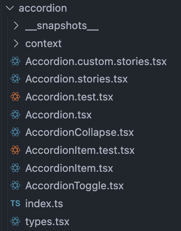
The main <Accordion /> component which is exposed as a final and single component looks like this:

As you can see, we have four different components and a context to share the internal state between the components.
And here is an example of its usage:
const DemoAccordion = (args: { className?: string; collapseAll?: boolean }) => (
    <Accordion {...args}>
        <Accordion.Item>
            <Accordion.Toggle>Item 1</Accordion.Toggle>
            <Accordion.Collapse>
                <div>Content 1</div>
            </Accordion.Collapse>
        </Accordion.Item>
        <Accordion.Item>
            <Accordion.Toggle>Item 2</Accordion.Toggle>
            <Accordion.Collapse>
                <div>Content 2</div>
            </Accordion.Collapse>
        </Accordion.Item>
        <Accordion.Item>
            <Accordion.Toggle>Item 3</Accordion.Toggle>
            <Accordion.Collapse>
                <div>Content 3</div>
            </Accordion.Collapse>
        </Accordion.Item>
    </Accordion>
);
By using the Compound Components pattern, we managed to create a simple, clear, flexible, and maintainable `<Accordion />` component while handling different complex use cases.
PS: If you’re interested in the complete code example, please, leave a comment below, and I’ll set up a GitHub Repo with the example.
Benefits Of Applying Compound Components Pattern In React
Clear API - components can be read like HTML while nesting shows the relationship between the components.
No prop drilling - shared state flows through context, not props.
Flexibility - users can reorder or skip parts without changing the internal logic.
Reusability - users can mix and match subcomponents across the map.
Testability - parent and children can be testes separately.
📌 TL;DR
Good component design and clear components APIs are important for the application’s codebase health.
Compound Components pattern group related UI pieces under one parent component.
Context can be used to share state, logic, and callbacks between children.
Leveraging the Compound Components pattern bring many benefits like no prop drilling, strong reusability and flexibility, and clean code.
That's all for today. I hope this was helpful. ✌️
How I can help you further?

Learn how to build better React Applications! 🚀
👋 Let’s connect
You can find me on LinkedIn, Twitter(X), Bluesky, or Threads.
I share daily practical tips to level up your skills and become a better engineer.
Thank you for being a great supporter, reader, and for your help in growing to 26.1K+ subscribers this week 🙏
You can also hit the like ❤️ button at the bottom to help support me or share this with a friend. It helps me a lot! 🙏
I am interested please
Thanks for the recap on this.
Built a pretty massive checkout flow that also needed localization, and to swap out sections for different promotions being offered.
Did it just like you propose! So clean with context and sub components
Composes different building block internal components either the same provider each time