
You're Using React Compound Components Wrong
The most-copied example in every tutorial is the one place you shouldn't use them.
The most popular compound component tutorial teaches the pattern wrong.
Every “Compound Components in React” article opens with the same example: a <Select> with <Option> children.
It looks elegant. It’s also the one case where you shouldn’t use the pattern at all.
I read TkDodo's take on this recently (yes, the React Query guy), and it put words to something that had been bugging me for years.
Compound components are great. We just keep reaching for them for the wrong job — and then fighting TypeScript to make that wrong job feel safe.
Share this post & I’ll send you some rewards for the referrals.
Your AI shouldn't grade its own homework (Partner)

Claude Code writes beautiful code. So does Codex.
But here’s the thing, they also think they write beautiful code.
And when you ask an AI to review code it just wrote, you get the intellectual equivalent of a student grading their own exam. Shockingly, they always pass.
CodeRabbit CLI plugs into Claude Code and Codex as an external reviewer, different AI Agent, different architecture, 40+ static analyzers and zero emotional attachment to the code it’s looking at. The agent writes, CodeRabbit reviews, and the agent fixes. Loop until clean.
You show up when there’s actually something worth approving.
One command. Autonomous generate-review-iterate cycles. The AI still does the work. It just doesn’t get to decide if the work is good anymore.
PS: Free tier available!
(Thanks to CodeRabbit for partnering on this post.)
What compound components actually are?
Quick recap, in case the term's fuzzy.
Compound components are a set of components that work together and share state behind the scenes, through a parent:
<Tabs>
  <Tabs.List>
    <Tabs.Tab>Profile</Tabs.Tab>
    <Tabs.Tab>Settings</Tabs.Tab>
  </Tabs.List>
  <Tabs.Panel>Profile content</Tabs.Panel>
  <Tabs.Panel>Settings content</Tabs.Panel>
</Tabs>
The <Tabs> parent tracks which tab is active. The children don’t talk to each other — they read from a shared context. And whoever uses <Tabs> gets to arrange the pieces however they like.
That’s the appeal. Now here’s where it goes sideways.
The example everyone copies is the wrong one
Almost every tutorial starts here:
<Select onChange={handleChange}>
  <Option value="apple">Apple</Option>
  <Option value="banana">Banana</Option>
  <Option value="cherry">Cherry</Option>
</Select>
Clean, right? Now here's what it turns into the moment you have real data:
<Select onChange={handleChange}>
  {fruits.map((fruit) => (
    <Option key={fruit.id} value={fruit.id}>
      {fruit.name}
    </Option>
  ))}
</Select>
You're mapping over an array to produce children.
That's a data-driven list wearing a compound-component costume.
The composition buys you nothing here, and a plain props API does the same job with less ceremony:
<Select
  options={fruits}
  getLabel={(f) => f.name}
  getValue={(f) => f.id}
  onChange={handleChange}
/>
Why is the props version better? Because once the options come from data, you want to do data things with them:
Sort, filter, or virtualize the list — easy with an array, awkward with children.
Drive keyboard navigation off that array, instead of walking the DOM or the React tree.
Get real type safety between the selected value and the options (more on that in a second).
Compound components are for layout flexibility. Not for rendering a list.
When the pattern actually earns its keep
Compound components shine when three things are true:
The content is mostly static — tab labels, toolbar buttons, accordion headers.
The consumer needs layout control — they decide where each piece goes.
The children are different from each other — a header, a body, a footer — not one shape repeated.
Think tabs, toolbars, dialogs, or a card with header/body/footer slots:
<Card>
  <Card.Header>
    <h2>User Profile</h2>
    <Badge status="active" />
  </Card.Header>
  <Card.Body>{/* whatever you want here */}</Card.Body>
  <Card.Footer>
    <Button onClick={save}>Save</Button>
  </Card.Footer>
</Card>
The consumer owns the layout. Card handles the coordination — spacing, theming, maybe collapsing — but it doesn’t dictate what goes inside each slot.
That’s the sweet spot: heterogeneous, mostly-static content where the structure is the consumer’s call.
The type-safety trap: don’t police your children
Here's the move that gets people into trouble. They try to restrict which children are allowed:
type SelectProps = {
  children: React.ReactElement<OptionProps>[];
};
The intent is “only <Option> in here, please.” It doesn’t hold up.
TypeScript’s checking of children through ReactElement is leaky — it’s the subject of a GitHub issue open since 2018. It might grumble about a stray <div>, but it falls apart on the things you actually write: {items.map(...)}, {condition && <Option />}, a fragment, a wrapper component that renders options. You end up with a type that looks safe and isn’t.
And TkDodo’s deeper point, which I’ve come around to: you don’t even want this. The urge to lock down children is usually the tell that you picked the wrong pattern — that this was a data list all along.
So put the type safety where it actually works: in the shared state.
Where the types should come from: context
The parent sets up a context; the children read it through a custom hook:
type TabsContextValue = {
  activeTab: string;
  setActiveTab: (tab: string) => void;
};

const TabsContext = createContext<TabsContextValue | null>(null);

function useTabsContext() {
  const ctx = useContext(TabsContext);
  if (!ctx) throw new Error("Tab.* must be used inside <Tabs>");
  return ctx;
}
The safety comes from the context shape, not from the children list. Any child that calls useTabsContext() gets fully-typed state. Any child that doesn’t is just inert markup — which is completely fine. A stray <div> in your <Tabs> doesn’t break anything; it just sits there.
Want to go a step further and type-check the tab values — so <Tab value="billing"> is allowed but <Tab value="notifications"> is a compile error? Make the whole thing generic. A small createTabs<T extends string>() factory threads your union of tab keys from one place, through the context, into every Tab and Panel:
const { Tabs, Tab, Panel } = createTabs<"profile" | "settings" | "billing">();

<Tab value="billing">Billing</Tab>      // ✅ fine
<Tab value="notifications">Nope</Tab>    // ❌ not a valid tab — caught at compile time
One gotcha if you build this: define useTabsContext inside the factory, so it closes over that call’s context. Reuse a module-level hook and your children read a different context object — and throw at runtime even when they’re nested correctly.
And if your tabs are described by a config object, satisfies is a nice finishing touch: const tabs = { ... } satisfies Record<string, TabConfig> validates the shape while keeping the literal keys, so keyof typeof tabs is your tab union. One source of truth, zero children-restriction gymnastics.
So which one do you reach for?
A quick gut-check when you’re deciding:
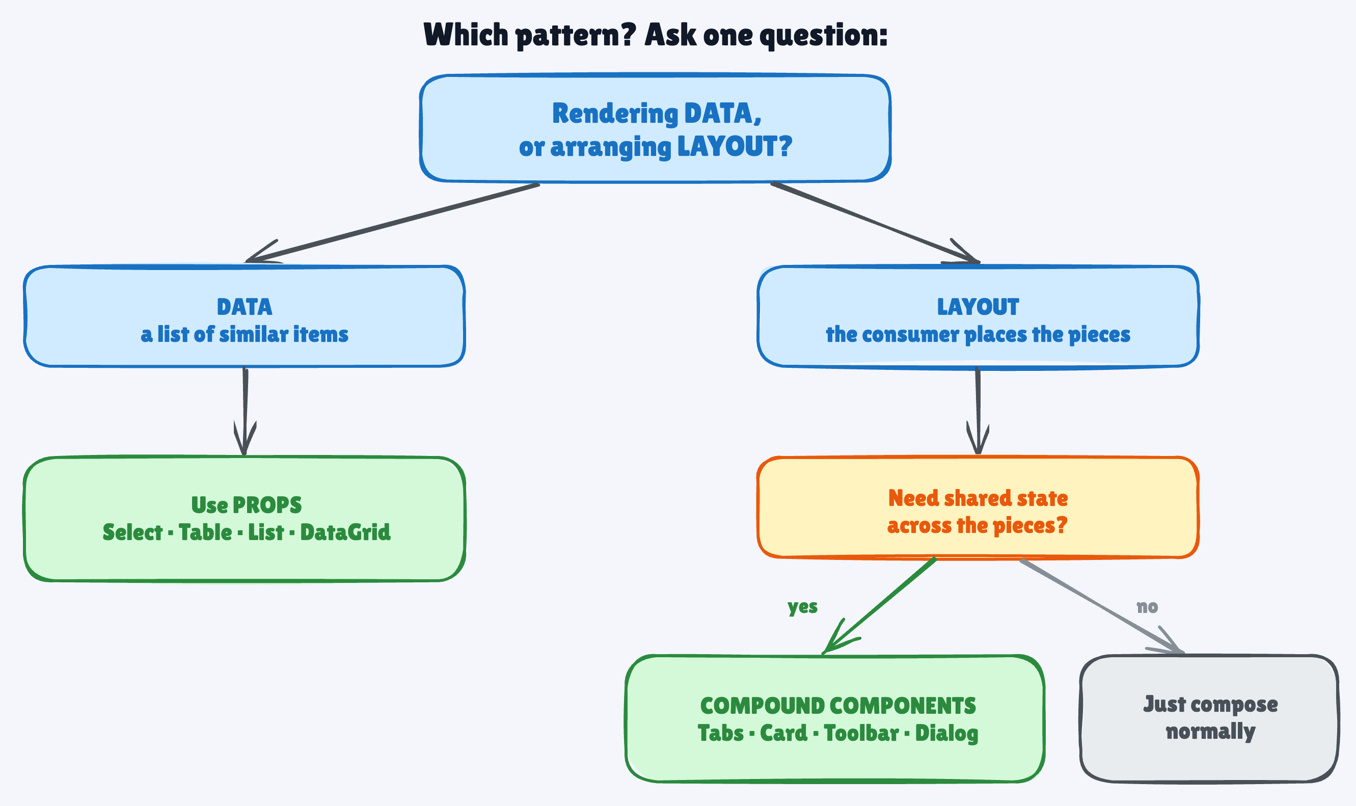
Compound components — the consumer needs layout control over mostly-static, heterogeneous content, and the parent coordinates behavior. Tabs, Accordion, Card, Toolbar, Dialog.
Plain props — you’re rendering a list of similar items from data, and you’ll want to sort, filter, or virtualize. Select, Table, DataGrid, List.
Render props / hooks — the consumer needs your internal state to drive their own rendering. Think Downshift or the React Aria hooks.
📌 TL;DR
Compound components are for layout, not data. Tabs, Card, Toolbar — yes.
<Select>with mapped<Option>s — no.Real type safety lives in shared context — and in a generic factory when you want the values checked too — not in policing which children are allowed.
Rendering from data? Props win. Sortable, filterable, virtualizable, and genuinely type-safe.
The 10-second rule: layout → compound components; data → props; need internal state exposed → render props or hooks.
Compound components are one of the nicer patterns React gives you. But a nice pattern pointed at the wrong problem is just complexity with good manners.
So before you reach for it, ask one thing:
Is this about arranging layout, or rendering data?
Layout: compound components hand your consumers real power without losing coordination.
Data: props are simpler, safer, and easier to grow.
Same question, every time.

Follow me on LinkedIn | Twitter(X) | Threads
Thank you for supporting this newsletter.
Consider sharing this post with your friends and get rewards.
You are the best! 🙏

Press the Like button if you found this post helpful